CASE STUDY: Proto Pemza Podcast - Aum Shinrikyo Episode Illustration
Client: Proto Pemza Podcast
Type: Editorial / Podcast illustration
Year: 2026
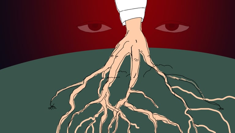
I was commissioned by the Proto Pemza Podcast to create cover artwork for a two-part episode exploring the history of the Japanese cult Aum Shinrikyo. Episodes examine the group’s ideology, influence, and the events surrounding the Tokyo subway sarin attack. The visual direction needed to convey a sense of unease and psychological tension without relying on explicit or literal imagery.
The first illustration needed to:
*Represent the disturbing influence and deep reach of the cult
*Feel ominous and psychologically tense rather than literal
*Work effectively as a podcast cover across digital platforms
Additionally, the project required a visual approach that could be adapted for a second episode while maintaining a consistent concept.
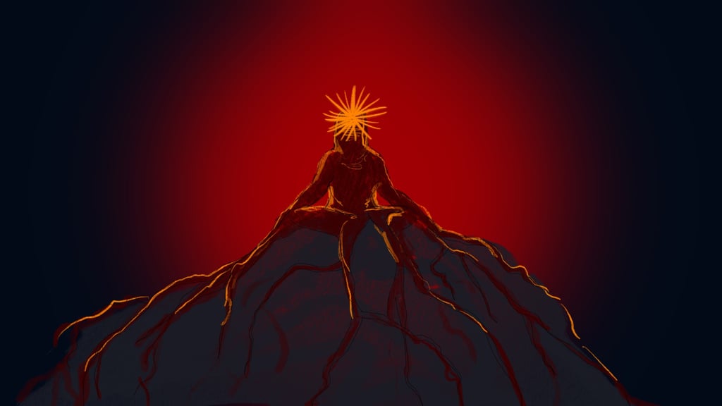

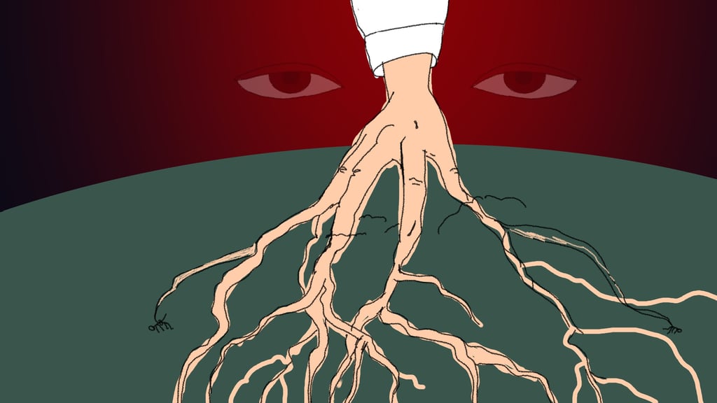

During the initial phase, I developed two different sketch directions exploring symbolic interpretations of control, secrecy, and influence. While both concepts communicated aspects of the theme, they did not fully align with the tone the client was looking for. Based on feedback, I moved toward a more focused and context-specific approach.
Exploration
Final concept
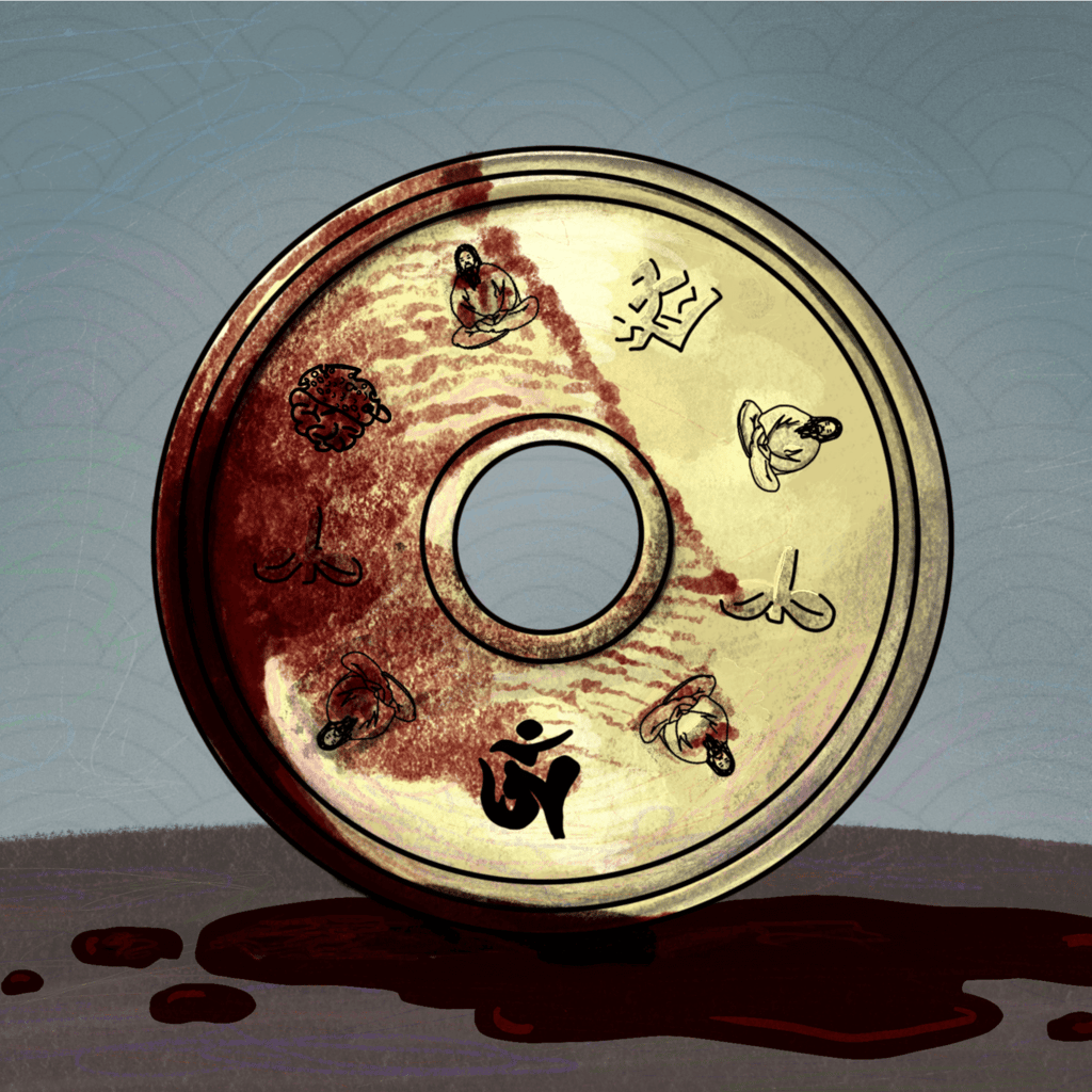
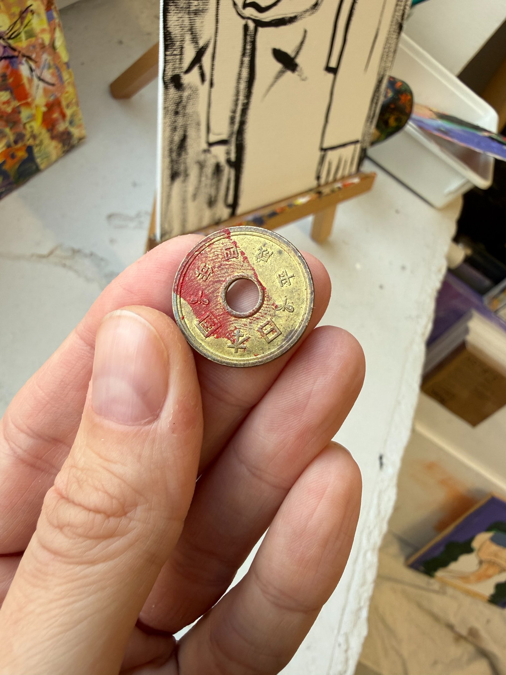
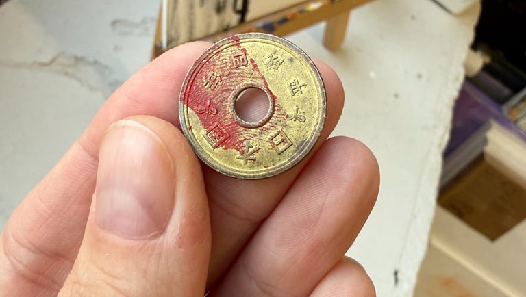
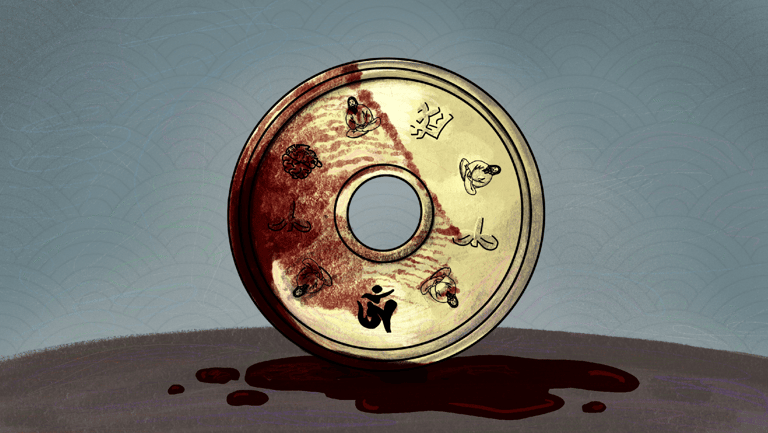
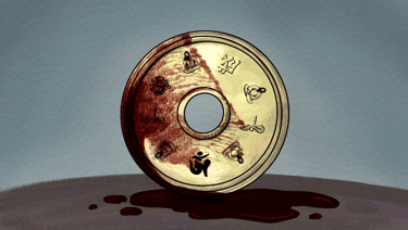
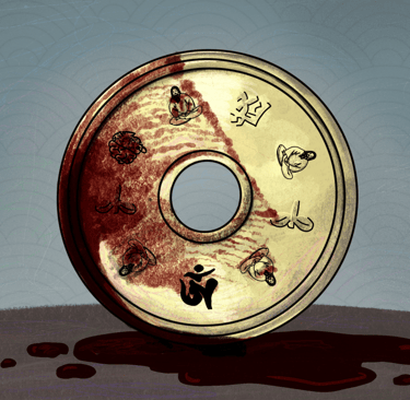
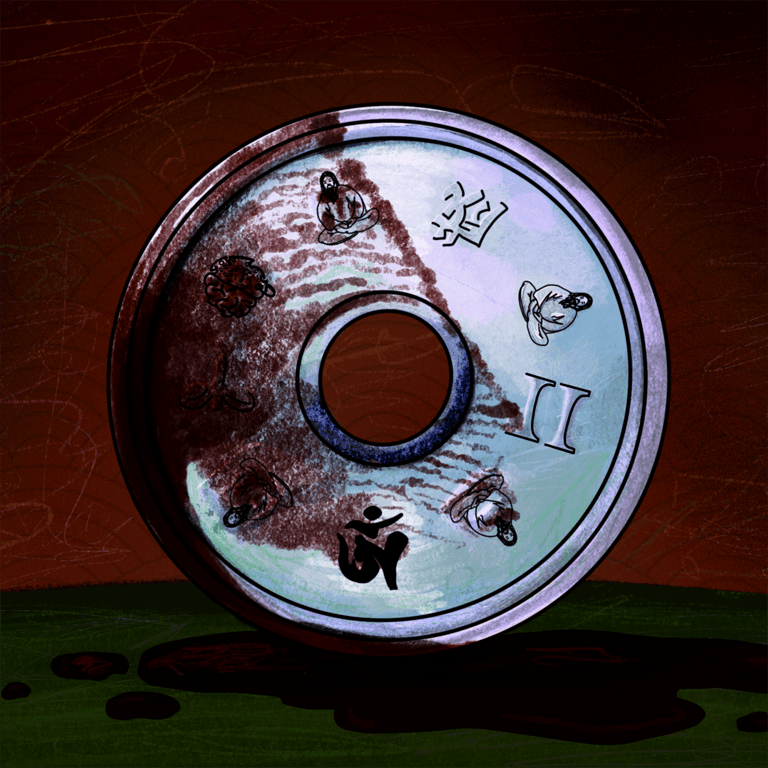
The approved concept centers around a Japanese yen coin.
Instead of preserving the original coin markings, I reinterpreted its details to embed narrative elements. The year markings were replaced with a depiction of Shoko Asahara, the leader of Aum Shinrikyo, shown in his recognizable levitating pose. I also incorporated the cult’s symbol and a stylized version of the Proto Pemza Podcast logo into the coin’s design.
To introduce a tactile and unsettling quality, I used a real coin as a base reference and pressed my fingerprint in red paint onto its surface. This gesture suggests a bloody trace or evidence left behind, reinforcing themes of human responsibility and the violent legacy associated with the cult.
The final image balances symbolism and atmosphere, creating a visual that feels tense and disturbing without being explicit.
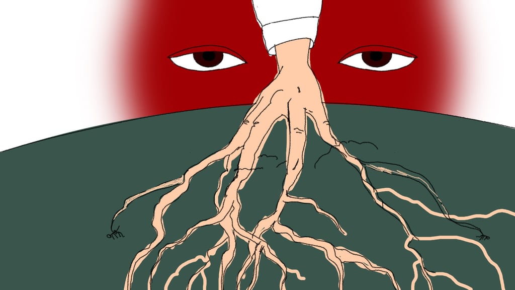
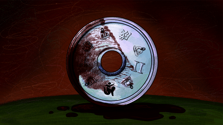
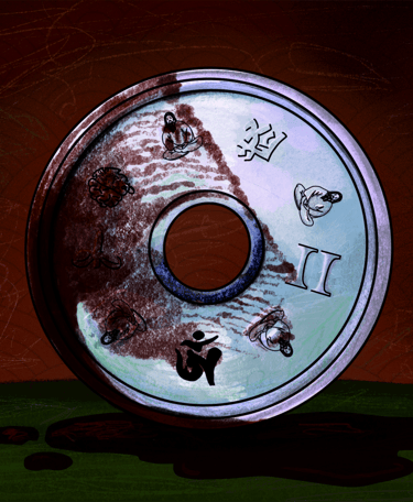
Part II Adaptation
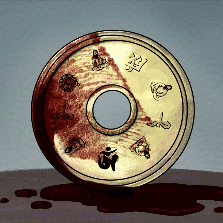
For the second part of the episode, I adapted the original illustration while maintaining the same composition.
The primary change was in the color treatment. The palette was pushed toward darker, more intense tones to reflect the escalation of the narrative and to create a more ominous and threatening atmosphere as well as a subtle change in the coin markings to indicate the roman numerals for 2.
This approach allowed both visuals to function as a cohesive set while clearly distinguishing the shift in tone between Part I and Part II.

Deliverables
Podcast cover illustration - Part I
Podcast cover illustration - Part II
Adapted assets for digital platforms
Tools used
Hand sketching
Traditional paint and photos for texture&references
Digital illustration and refinement